
The Detail About Candles And Charts
Technical analysis platforms (like Trading View or MetaTrader) categorize charts into three main groups based on how they process data.
1. Traditional (Time-Based) Charts
These are the most common charts. A new bar or point is created after a specific amount of time passes (e.g., 1 minute, 1 hour, 1 day).
- Line Chart: Connects closing prices with a single line. Best for high-level trend views.
- Bar Chart (OHLC): Uses vertical lines with left/right ticks to show Open, High, Low, and Close.
- Candlestick Chart: The industry standard. Uses colored “bodies” to show price movement and sentiment.
- Area Chart: A line chart with the space below the line filled in. Useful for visualizing volume or total value over time.
- Hollow Candles: Similar to standard candles but uses hollow/filled bodies to distinguish between price movement and the previous day’s close.
- Baseline Chart: Shows price fluctuations relative to a fixed horizontal baseline (to see if an asset is “above” or “below” a specific price).
2. Trend-Smoothing Charts
These use mathematical formulas to “smooth” the price action, making it easier to see the primary trend by reducing volatility “noise.”
- Heikin Ashi: Uses averaged price data to create smoother colored trends.
- Renko Charts: Built using “bricks.” A new brick only forms if the price moves a specific distance, regardless of time.
- Kagi Chart: Uses vertical lines of varying thickness. The line changes thickness when a previous high or low is broken.
3. Price-Action (Non-Time) Charts
These ignore time entirely. A new bar only forms when a specific price or volume event occurs.
- Range Bars: A new bar forms only when the price travels a specific distance (range).
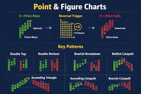
- Point and Figure (P&F): Uses columns of “X”s (rising) and “O”s (falling). It only records significant price reversals.
- Tick Charts: A new bar forms after a specific number of transactions (ticks) occur, regardless of how many shares were traded.
- Volume Candles: The width of the candle changes based on the amount of volume traded during that period.
Summary Comparison Table
| Category | Primary Focus | Examples |
| Standard | Time & Price | Line, Bar, Candlestick |
| Smoothing | Trend Clarity | Heikin Ashi, Renko |
| Non-Time | Volatility/Activity | Range, Point & Figure, Tick |
Line, bar, and candlestick charts remain the foundational visual tools of technical analysis. Despite their visual differences, they share several core characteristics:
- Same Underlying Data Source: All three charts utilize the same historical market data—primarily the closing price. Bar and candlestick charts expand on this by using the Open, High, Low, and Close (OHLC) prices.
- Time-Based Framework: They are typically plotted on a standard X-axis representing time. A single line point, bar, or candle represents a fixed interval (e.g., 5 minutes, 1 hour, or 1 day).
- Common Analytical Goals: Traders use all three types to identify the same critical market signals, including:
- Trend Direction: Determining if the market is moving up, down, or sideways.
- Support and Resistance: Identifying price levels where a trend may pause or reverse.
- Market Sentiment: Gauging whether buyers (bulls) or sellers (bears) are currently in control.
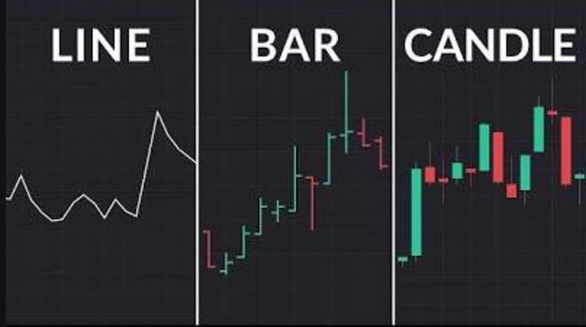
The candlestick chart is the most popular type of chart used for detailed technical analysis. It was developed by Japanese rice traders in the 18th century and is highly effective at visualizing market sentiment through a security’s price movements.
Technical analysis platforms (like TradingView or MetaTrader) categorize charts into three main groups based on how they process data.
Candlestick Chart
- Information Displayed: Provides the most detailed visual representation, showing the open, high, low, and closing prices (OHLC) for a specific period.
- Appearance: Features a “body” (the range between open and close prices) and “wicks” or “shadows” (the highest and lowest prices reached). The body is color-coded (typically green for a price increase, red for a price decrease) for easy visual interpretation of market sentiment.
- Usage: Widely used by traders to quickly interpret price movements and identify specific patterns (e.g., hammer, engulfing) that can signal potential trend reversals or continuations.
Reading the Colors-
- Green/Bullish Candle: The closing price was higher than the opening price. This generally indicates that buyers were in control. The body extends from the open (bottom) to the close (top).
- Red/Bearish Candle: The closing price was lower than the opening price. This generally indicates that sellers were in control. The body extends from the open (top) to the close (bottom).
Why Traders Use Candlesticks
Traders favor candlesticks because they offer more information than a simple line or bar chart. The interplay between the body size, wick length, and color provides quick visual signals about market momentum, indecision, and potential turning points. Specific patterns, like a “hammer” or “engulfing bar,” are used to predict future price direction.
Line Chart
- Information Displayed: The most basic chart, created by connecting a single data point over time, usually the closing price of an asset.
- Appearance: A simple, continuous line graph.
- Usage: Best for getting a high-level, clear view of the overall price trend over a long period without the “noise” of intraday price fluctuations. It provides fewer details than bar or candlestick charts.
Bar Chart
- Information Displayed: Also known as an OHLC chart, it displays the open, high, low, and closing prices for each period, similar to candlestick charts.
- Appearance: Each bar is a single vertical line. A small horizontal tick on the left indicates the opening price, and a small horizontal tick on the right indicates the closing price.
- Usage: Offers a detailed view of price action and volatility for a given period. Some professional traders prefer it for its less visually cluttered, more “neutral” look compared to the colored bodies of candlesticks.
Volume Chart
- Information Displayed: Typically displayed as a histogram of vertical bars at the bottom of a price chart, showing the total number of shares or contracts traded during each specific time frame.
- Appearance: Vertical bars where the height corresponds to the volume traded during that period. They are often color-coded to match whether the price closed higher or lower than the previous close.
- Usage: Volume is a crucial secondary indicator used to confirm the strength or legitimacy of price movements and trends. High volume accompanying a price change suggests strong conviction in the move, while low volume may indicate a weak trend or indecision.
Professional traders increasingly use “noise-filtering” charts like Heikin Ashi, Point and Figure, and Range bars to isolate true market trends from minor price fluctuations.
1. Heikin Ashi (Average Bars)
Heikin Ashi means “average bar” in Japanese. Unlike standard candlesticks that use raw data, these use a mathematical formula to average price movement, creating a smoother look.
- How it’s calculated: It uses the average of the Open, High, Low, and Close of the current and previous periods.
- Visual Difference: You will see long streaks of green (uptrend) or red (downtrend) without the alternating colors found in standard charts.Best For: Identifying the beginning and end of a trend. Small bodies with long wicks indicate a potential trend change, while long bodies with no wicks on one side indicate strong momentum.
Actionable Resource: You can apply this view on most platforms; see the TradingView Heiki nashi Guide for setup.
2. Point and Figure (P&F)
This is a unique chart that ignores time and only focuses on significant price changes. It is one of the oldest forms of technical analysis.
- Appearance: It uses columns of “X”s (rising prices) and “O”s (falling prices).
- How it works: A new “X” or “O” is only added if the price moves by a specific “Box Size” (e.g., $1.00). If the price doesn’t move enough, the chart stays the same, even if days pass.
- Best For: Identifying long-term support and resistance levels and clear breakout patterns. It eliminates “market noise” entirely during periods of stagnation.
- Actionable Resource: Learn more about the specific “3-box reversal” rule at StockCharts ChartSchool.
3. Range Bars
Like Point and Figure, Range bars are independent of time. A new bar is only created when the price moves a specific distance (the “range”).
- Appearance: All bars on a Range chart have the same vertical height (the body size is identical).
- How it works: If you set a 10-tick range, a bar will only close and a new one start once the price has travelled 10 ticks. During a fast-moving market, many bars will form; during a slow market, a single bar might take hours to finish.
- Best For: Identifying volatility and clear horizontal support/resistance. It is highly popular among scalpers and day traders who want to see price action without the distraction of time based.
Comparison Table
| Chart Type | Based On | Primary Benefit | Best User |
| Heikin Ashi | Time + Price | Smooths out trends | Swing Traders |
| Point & Figure | Price Only | Clear support/resistance | Long-term Investors |
| Range Bars | Price Only | Visualizes volatility | Day Traders/Scalpers |
Disclaimer: I am not a SEBI registered investment advisor. The content in this article is for educational purposes only and should not be considered financial advice. While we strive for accuracy, the information and data mentioned may vary, and human error is possible. Please consult your financial advisor before making any investment decisions.