

Technical analysis is the study of price movements and charts to understand how markets behave over time.
Instead of focusing on a company’s business or financials, technical analysis focuses on how prices move, where buyers and sellers act, and how trends form.
This section is designed to help beginners understand charts and market behavior, without promoting risky or aggressive trading.
The goal is awareness and clarity, not prediction or shortcuts.
This is for:
Beginners who want to understand market charts before making any trading or investing decisions.
This section is ideal if you:
- Feel confused by stock charts
- Want to know why prices move up and down
- Want to avoid emotional or impulsive decisions
- Are curious about technical analysis but want a responsible introduction
What You’ll Learn Here
By the end of this section, you will understand:
- What technical analysis actually means
- Why stock prices move the way they do
- Basic types of stock charts
- Core concepts like trends, support, and resistance
- Common indicators used by traders
- How to use technical analysis responsibly, especially as a beginner
How This Section Is Structured
This section is broken into simple, beginner-friendly lessons, focused on understanding — not trading aggressively.
Lesson 1 – What Is Technical Analysis?
Before learning charts, indicators, or patterns, it is essential to clearly understand what technical analysis is, why it exists, and how it should be used.
Technical analysis is the study of price behavior and market activity to understand how financial markets function.
Rather than evaluating a company’s business or financial health, technical analysis focuses on how prices move, why they move, and what that movement reveals about market participants.
At its core, technical analysis is the study of human behavior expressed through price.
What Technical Analysis Really Studies
Technical analysis studies:
- Price movement over time
- Market trends and structure
- Buyer and seller behavior
- Market psychology (fear, greed, confidence, panic)
- Repeated patterns formed due to collective decision-making
It deliberately avoids:
- Balance sheets and profit statements
- Business models and management quality
- Long-term company forecasts
Key distinction:
- Fundamental analysis asks: “What should this company be worth?”
- Technical analysis asks: “How is the market actually behaving?”
Both approaches are complementary — not contradictory.
Why Price Is Central to Technical Analysis
Price is the final and most honest output of the market.
Every market price already reflects:
- Known information
- Expectations about the future
- Emotional reactions to news
- Institutional and retail positioning
Even conflicting opinions are resolved into one visible number — the price.
Because of this, technical analysts believe that:
“Everything that matters is already visible through price behavior.”
The Three Core Principles of Technical Analysis
All technical tools — charts, indicators, patterns — are built on these three foundational ideas.
Price Reflects All Available Information
Market prices incorporate:
- Fundamentals
- News and events
- Sentiment and expectations
- Institutional activity
This does not mean markets are always correct — it means price reflects the current consensus, not objective truth.
Advanced insight:
Markets are efficient in the short term in reflecting information, but inefficient in emotional response, which creates opportunities.
Prices Move in Trends
Prices tend to move in directional phases rather than randomly.
Trends can be:
- Uptrend: Higher highs and higher lows
- Downtrend: Lower highs and lower lows
- Range-bound: Sideways movement
Understanding trends helps:
- Investors stay aligned with long-term direction
- Traders avoid fighting the market
- Risk managers define invalidation points
Expert perspective:
Trends exist across all timeframes — from minutes to decades.
History Tends to Repeat Itself
Market patterns repeat because human psychology repeats.
Fear, greed, hesitation, and confidence create:
- Support and resistance levels
- Breakouts and breakdowns
- Overreaction and correction cycles
Prices don’t repeat exactly — behavior does.
Important nuance:
Patterns are not guarantees; they are probability frameworks.
Technical Analysis as Market Psychology
Technical analysis is not about predicting prices — it is about interpreting behavior.
Every chart reflects:
- Who is in control (buyers or sellers)
- Where participants feel confident
- Where fear increases
- Where uncertainty emerges
For experienced participants, charts act as a real-time sentiment map.
What Technical Analysis Is — and Is Not
What It IS:
- A framework to understand market behavior
- A decision-support system
- A tool for timing entries and exits
- A way to manage risk objectively
What It Is NOT:
- A prediction machine
- A shortcut to fast profits
- A replacement for risk management
- A guarantee of success
Critical reminder:
Technical analysis improves decision quality, not outcomes.
How Different Participants Use Technical Analysis
Beginners
- Learn how markets move
- Understand charts and trends
- Avoid emotional decisions
Intermediate Investors & Traders
- Identify high-probability zones
- Time entries and exits
- Combine with fundamentals
Advanced & Professional Users
- Analyze market structure
- Study volume and participation
- Manage risk and position sizing
- Interpret inter-market behavior
Same tool — different depth of application.
Responsible Use of Technical Analysis
At Samnidhi Insights, technical analysis is taught as:
- A supporting tool, not a primary promise
- A way to reduce mistakes, not chase returns
- A skill that requires discipline and patience
Not encouraged:
- Overtrading
- Indicator overload
- Emotional or impulsive decisions
Key Takeaways from Lesson 1
- Technical analysis studies price behavior, not business value
- Price reflects collective market psychology
- Trends provide structure to market movement
- Patterns repeat due to human behavior
- Technical analysis works on probabilities, not certainty
- Risk management is essential at every level
Lesson 2 – Why Do Prices Move?
Every price movement in the market has a reason — even when it appears random.
Prices do not move because of charts or indicators.
They move because of human decisions made by millions of participants reacting to information, expectations, and emotions.
Understanding why prices move is the foundation of all technical analysis.
The Core Driver: Demand and Supply
At the most basic level, price movement is governed by demand and supply.
- More buyers than sellers → price moves up
- More sellers than buyers → price moves down
- Balanced buyers and sellers → price moves sideways
Every candle, bar, or line on a chart is a visual representation of this balance.
Even advanced market structures eventually reduce to this simple equation.
Who Creates Demand and Supply?
Demand and supply come from market participants, not from charts.
Key participants include:
- Retail investors and traders
- Institutional investors (mutual funds, FIIs, DIIs, hedge funds)
- Algorithmic and high-frequency traders
- Market makers
Each group operates with different Each group operates with different objectives, timeframes, and information, which creates continuous price movement.
Important insight:
Retail traders do not move markets alone — institutions create trends.
Key Factors That Move Prices
Price movement is usually the result of multiple forces acting together.
News and Events
Prices react to:
- Earnings results
- Economic data (inflation, interest rates, GDP)
- Policy decisions and regulations
- Global events and crises
Short-term prices often move before news becomes public due to expectations.
Expectations vs Reality
Markets move not on news alone, but on:
Whether the outcome meets, beats, or disappoints expectations
Example:
- Good results but lower-than-expected → price may fall
- Bad results but better-than-expected → price may rise
Advanced understanding:
Markets price the future, not the present.
Institutional Positioning
Large institutions:
- Build positions over time
- Cannot buy or sell instantly
- Leave footprints through volume and price structure
This creates:
- Trends
- Consolidation phases
- Breakouts and breakdowns
Technical analysis often focuses on identifying institutional activity zones.
Market Sentiment and Emotions
Emotions play a powerful role in price movement:
Confidence → sustained trends
Fear → sharp selling
Greed → rapid buying
Uncertainty → sideways movement
Charts visually reflect these emotional cycles.
Markets move faster on fear than on optimism.
Why Prices Trend Instead of Moving Randomly
Prices tend to move in trends because:
- Institutions build positions gradually
- Human behavior is repetitive
- Momentum attracts more participation
Once a trend begins:
- Buyers gain confidence in uptrends
- Sellers dominate in downtrends
Trends persist until new information or imbalance appears.
Volatility: The Speed of Price Movement
Volatility refers to how fast and how much prices move.
- High volatility → large, fast price swings
- Low volatility → slow, tight price movement
Volatility increases during:
- News events
- Market uncertainty
- Breakouts from ranges
Volatility is not risk by itself — unmanaged volatility is risk.
The Role of Liquidity
Liquidity determines how easily assets can be bought or sold.
- High liquidity → smoother price movement
- Low liquidity → sudden spikes and gaps
Beginners should avoid low-liquidity stocks due to unpredictable behavior.
Common Beginner Misunderstanding
“Indicators make prices move”
Prices move first — indicators react later
Indicators interpret movement, they do not create it.
Price Movement Across Timeframes
Price behavior changes depending on timeframe:
- Short-term → noise, news reactions, emotions
- Medium-term → trends and consolidations
- Long-term → economic and business cycles
The same stock can be bullish on one timeframe and bearish on another.
Key Takeaways from Lesson 2
- Prices move due to demand and supply imbalance
- Market participants drive price movement
- News, expectations, and emotions influence prices
- Trends exist due to institutional behavior
- Volatility reflects uncertainty and momentum
- Indicators respond to price — not the other way around
Lesson 3: Types Of Stock Charts
Charts are the language of technical analysis.
They visually represent how prices move over time and help market participants understand trends, momentum, and market behavior at a glance. While charts may look complex initially, they all aim to answer one simple question:
What has price done in the past, and how is it behaving now?
This lesson focuses on understanding different types of charts — from basic to advanced — and how to use them responsibly.
Why Charts Matter in Technical Analysis
Charts help you:
- Visualize price movement clearly
- Identify trends and ranges
- Spot key price levels
- Understand buyer and seller behavior
- Reduce emotional decision-making
Charts do not predict the future — they provide structure and context.
Visual Example: Same Price, Different View
Example: Assume a stock moves from ₹100 to ₹160 over one year.
- A line chart shows a smooth upward slope
- A candlestick chart shows multiple rallies, pullbacks, and pausesThe destination may look the same, but the journey looks very different on charts.
Charts help you:
- Visualize price movement clearly
- Identify trends and ranges
- Spot key price levels
- Understand buyer and seller behavior
- Reduce emotional decision-making
Charts do not predict the future — they provide structure and context.
The Three Most Common Types of Stock Charts
All charts display price over time, but the way they present information differs.
Line Chart (Best for Absolute Beginners)
A line chart connects the closing prices of an asset over a chosen timeframe.
How a Line Chart Looks
- One continuous line
- Each point represents a closing price
(Suggested image: Simple line chart showing a gradual uptrend)
Practical Example
If a stock closes at:
- Monday: ₹100
- Tuesday: ₹102
- Wednesday: ₹101
The line chart simply connects these closing prices.
When to Use Line Charts
- Understanding long-term trends
- Getting a broad market view
- Early-stage learning
Limitation: You cannot see intraday volatility or price rejection.
A line chart connects the closing prices of an asset over a chosen timeframe.
Key Characteristics
- Uses only one data point per period (closing price)
- Smooth and easy to read
- Filters out intraday noise
When to Use Line Charts
- Understanding long-term trends
- Getting a broad market view
- Early-stage learning
Limitation: You cannot see price volatility within the period.
Bar Chart (More Detail, Less Popular Today)
A bar chart shows four key prices for each period:
- Open
- High
- Low
- Close
How to Read a Bar
- Vertical line → high to low
- Left tick → opening price
- Right tick → closing price
Practical Insight
Bar charts show volatility and direction, but require practice to read quickly.
Limitation: Information-rich but visually less intuitive for beginners.
A bar chart shows four key prices:
- Open
- High
- Low
- Close
Each bar represents one time period.
What a Bar Shows
- Vertical line → high to low
- Left tick → opening price
- Right tick → closing price
Who Uses Bar Charts
- Experienced traders
- Analysts trained in classical charting
Limitation: Bar charts are information-rich but visually less intuitive for beginners.
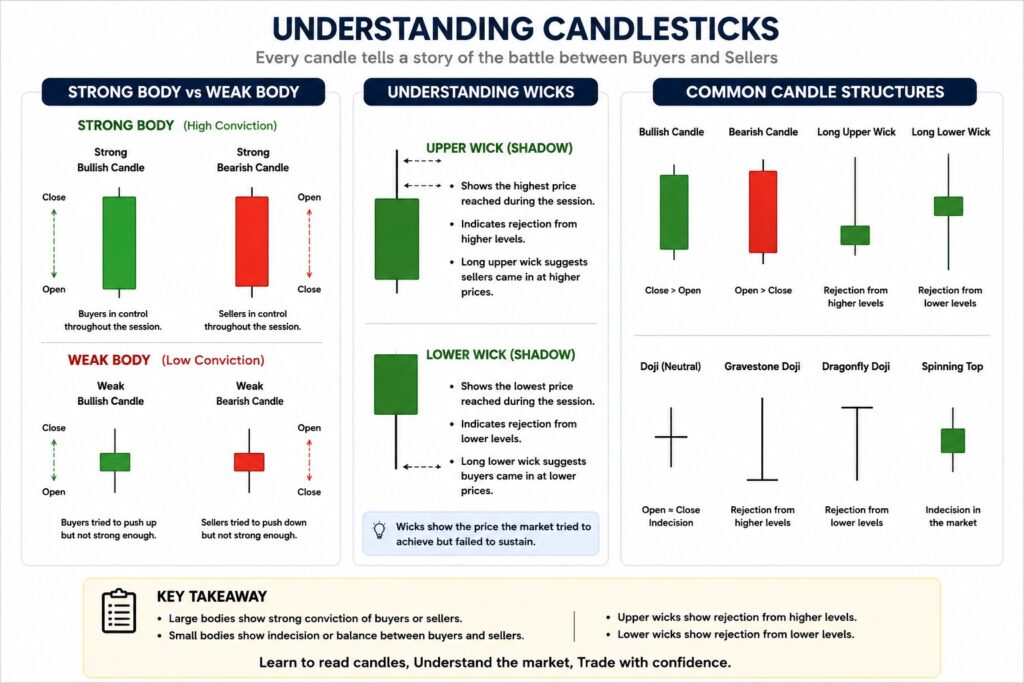
Candlestick Chart (Most Widely Used)
Candlestick charts display the same data as bar charts, but in a visually intuitive format.
Anatomy of a Candlestick
- Body → difference between open and close
- Upper wick → highest price
- Lower wick → lowest price
Practical Example
- Long green body → strong buying pressure
- Long upper wick → price rejection from higher levels
- Small body with long wicks → indecision
Candlesticks visually reflect market psychology.
Candlestick charts are the most popular chart type globally.
They show the same information as bar charts but in a visually intuitive format.
Anatomy of a Candlestick
- Body → difference between open and close
- Wicks (shadows) → high and low
What Candlesticks Reveal
- Strength of buyers vs sellers
- Market indecision
- Momentum and reversals
Candlesticks reflect market psychology, not just price.
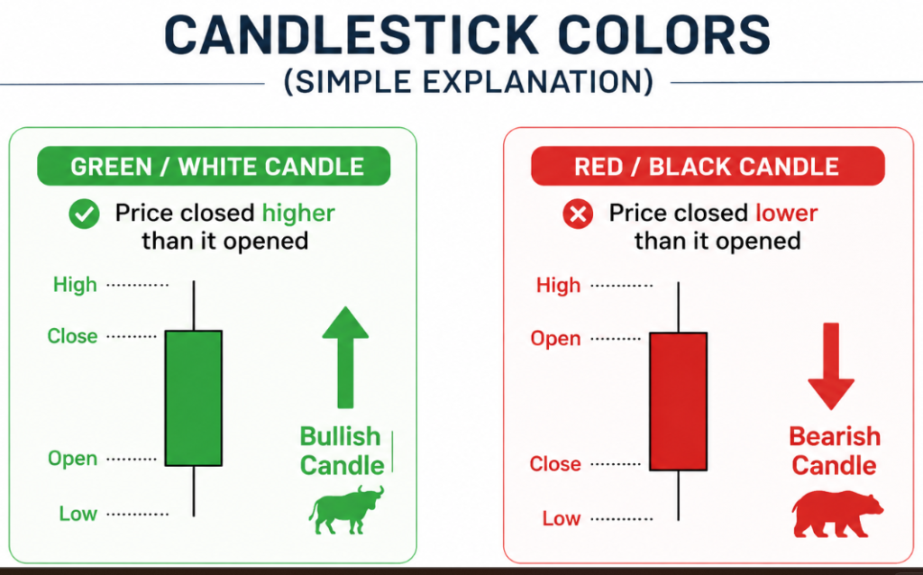
Candlestick Colors (Simple Explanation)
- Green / White candle → price closed higher than it opened
- Red / Black candle → price closed lower than it opened
Color is visual aid — structure matters more than color.
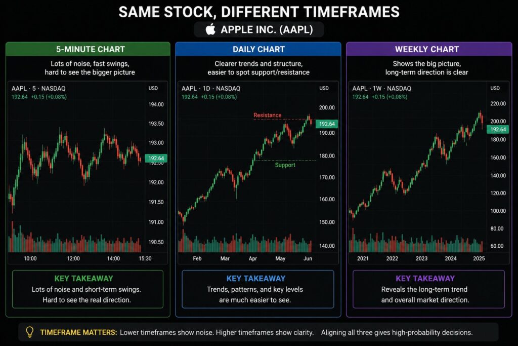
Timeframes and Charts
Charts behave differently across timeframes.
Example: Same Stock, Different Timeframes
- 5‑minute chart → noise, fast swings
- Daily chart → trends and structure
- Weekly chart → long-term direction
(Suggested image: Same stock shown on 5‑min, daily, and weekly charts)
Always choose timeframe based on your goal — not excitement.
Charts change behavior based on timeframe:
- Short timeframes → more noise, faster decisions
- Long timeframes → smoother trends, stronger signals
The same chart pattern may have different meanings on different timeframes.
Choosing the Right Chart Type
| Goal | Recommended Chart |
|---|---|
| Market overview | Line Chart |
| Price structure | Candlestick Chart |
| Classical analysis | Bar Chart |
Most traders eventually use candlestick charts as their primary tool.
Common Beginner Mistakes
Memorizing candlestick patterns without context Ignoring trends and higher timeframes Constantly switching chart types
Focus on price structure first Keep charts clean one chart type is enough
Jumping to candlestick patterns without understanding trends Using too many chart types at once Switching charts frequently due to confusion
Start simple → build gradually
Advanced Insight (For Intermediate & Experts)
Professional traders focus less on individual candles and more on:
- Price structure
- Swing highs and lows
- Location of candles relative to trends and key levels
Context matters more than patterns.
Key Takeaways from Lesson 3
- Charts visualize price behavior
- Line charts offer simplicity
- Bar charts offer structure
- Candlestick charts offer insight into psychology
- No chart predicts the future
Lesson 4: Trends And Trendlines
Once you understand how price is displayed on charts, the next and most important step in technical analysis is understanding direction.
Markets do not move randomly all the time. Most of the time, prices move in trends. Identifying the trend helps you avoid fighting the market and making emotional decisions.
This lesson explains what trends are, how to identify them, and how trendlines help visualize market direction.
What Is a Trend?
A trend is the general direction in which the price of an asset is moving over a period of time.
Instead of focusing on short-term noise, trends help you see the bigger picture.
Simple idea:
Trend = Direction of price movement
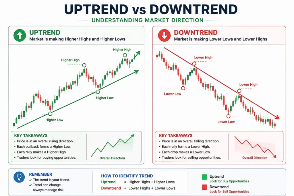
The Three Types of Trends
Uptrend
An uptrend is formed when prices:
- Make higher highs
- Make higher lows
This shows that buyers are in control and are willing to buy at higher prices.
(Suggested image: Daily candlestick chart showing higher highs and higher lows)
In an uptrend, pullbacks are normal — they do not mean the trend is broken.
Downtrend
A downtrend is formed when prices:
- Make lower highs
- Make lower lows
This indicates strong selling pressure.
(Suggested image: Daily chart showing lower highs and lower lows)
Beginner insight:
Rallies during a downtrend are often temporary.
Sideways / Range-Bound Market
A sideways trend occurs when prices:
- Move within a range
- Do not make clear higher highs or lower lows
This usually indicates indecision between buyers and sellers.
(Suggested image: Price moving between support and resistance)
Important:
Most markets spend more time consolidating than trending.
Why Trends Matter
Understanding trends helps you:
- Trade or invest with market direction
- Avoid buying against strong selling pressure
- Reduce emotional decision-making
- Improve timing for entries and exits
Golden rule:
The trend is your friend — until it ends.
What Is a Trendline?
A trendline is a straight line drawn on a chart to connect important price points and highlight the direction of a trend.
Trendlines act as visual guides, not exact levels.
How to Draw Trendlines (Simple Rules)
Uptrend Trendline
- Connect two or more higher lows
- Line slopes upward
Downtrend Trendline
- Connect two or more lower highs
- Line slopes downward
More touchpoints = stronger trendline
Trendline Breaks – What They Mean
When price breaks a trendline, it may indicate:
- Trend weakening
- Pause or consolidation
- Possible trend reversal
Important for all levels:
A trendline break is a signal, not confirmation.
Always look for context and confirmation.
Common Beginner Mistakes
Drawing trendlines through candles instead of swing points Forcing trendlines to fit your bias Assuming one trendline break means reversal
Use clear swing highs and lows
Let price decide the trend
Advanced Insight (For Intermediate & Experts)
Experienced traders focus on:
- Multiple timeframe trend alignment
- Structure shifts (higher low → lower low)
- Trend strength and slope
Strong trends often end with loss of momentum, not sudden collapse.
Key Takeaways from Lesson 4
- Trends show market direction
- Uptrend, downtrend, and sideways are the three main types
- Trendlines help visualize trends
- Trendlines are guides, not guarantees
- Trading with the trend reduces risk
Lesson 5: Support And Resistance
Support and resistance are the foundation of technical analysis.
Almost every chart pattern, indicator, and strategy ultimately revolves around these two ideas:
Where do buyers step in?
Where do sellers take control?
If you understand support and resistance well, you can read charts with clarity instead of confusion.
What Is Support?
Support is a price level where demand is strong enough to stop prices from falling further.
At support:
- Buyers become active
- Selling pressure weakens
- Prices often bounce upward
Support represents a price area, not a single exact line.
What Is Resistance?
Resistance is a price level where supply is strong enough to stop prices from rising further.
At resistance:
- Sellers dominate
- Buying pressure weakens
- Prices often reverse downward
Like support, resistance is also a zone, not a precise number.
Simple Market Psychology Behind Support & Resistance
Why do these levels work?
Example:
- A stock falls to ₹200 and bounces
- Traders remember ₹200 as “cheap”
- When price returns near ₹200:
- Buyers enter again
- Sellers hesitate
Similarly:
- A stock rises to ₹350 and reverses
- Traders remember ₹350 as “expensive”
- Selling pressure increases near that level
Markets have memory — charts reflect collective human behavior.
Types of Support and Resistance
Horizontal Support & Resistance (Most Important)
These are levels where price has repeatedly reversed.
Characteristics:
- Easy to spot
- Works across all timeframes
- Used by beginners and professionals alike
Dynamic Support & Resistance (Trend-Based)
In trending markets, support and resistance move with price.
Examples:
- Rising trendline acting as support
- Falling trendline acting as resistance
- Moving averages acting as dynamic levels
Dynamic levels are powerful during strong trends.
Psychological Levels
These are round numbers that attract attention.
Examples:
- ₹100, ₹500, ₹1000
- Nifty 20,000 / 22,000
Why they matter:
- Humans think in round numbers
- Orders cluster around these levels
Psychological levels often act as temporary support or resistance.
Role Reversal: Support Turns Into Resistance (and Vice Versa)
One of the most important concepts in trading.
- When support breaks → it often becomes resistance
- When resistance breaks → it often becomes support
This happens because trapped traders change their behavior.
How to Draw Support and Resistance Correctly
Use zones, not thin lines Focus on multiple touches Start with higher timeframes (daily/weekly) Adjust levels as price evolves
Avoid forcing levels Avoid drawing too many lines Avoid focusing only on intraday noise
Support & Resistance Across Timeframes
- Higher timeframe levels → stronger impact
- Lower timeframe levels → short-term reactions
Example:
- Weekly support overrides 5-minute resistance
Always respect the higher timeframe first.
Common Beginner Mistakes
Treating levels as exact prices Drawing too many support/resistance lines Ignoring trend direction Expecting price to reverse every time
Think in zones Combine with trend analysis Wait for confirmation
Advanced Insight (For Intermediate & Experts)
Professionals focus on:
- Location of price relative to major levels
- Strength of rejection (wick vs body)
- Volume behavior near levels
- Time spent near support/resistance
Strong breakouts usually come after consolidation near key levels.
Key Takeaways from Lesson 5
- Support = buying interest zone
- Resistance = selling interest zone
- Levels are zones, not exact lines
- Broken levels often change roles
- Context and timeframe matter
Lesson 6 – Indicators (Basic Introduction)
Indicators are tools that help you interpret price behavior, not predict the future.
They are mathematical calculations applied to price or volume data and are used to provide additional perspective on trends, momentum, and strength. While indicators can be useful, they should support price analysis, not replace it.
This lesson introduces indicators in a responsible, practical way, focusing on understanding rather than signal-chasing.
What Are Indicators?
Indicators are visual tools plotted on or below price charts to help answer questions such as:
- Is the trend strong or weak?
- Is momentum increasing or slowing?
- Is buying or selling pressure dominant?
- Is the market overextended?
Key principle:
Indicators simplify information — they do not create certainty.
Why Indicators Exist
Markets generate vast amounts of price data. Indicators help by:
- Filtering noise
- Highlighting trends and momentum
- Adding confirmation to price-based observations
- Helping with consistency and discipline
Professional traders use very few indicators, often just one or two.
Important Rule Before Using Indicators
Price comes first. Indicators come second.
Indicators are derived from price — meaning:
- They lag price
- They cannot lead price
- Misuse can cause late entries or false confidence
Always analyze:
- Trend
- Support & resistance
- Then indicators (if needed)
Common Beginner Indicators (You Only Need These)
Moving Averages (Most Important Indicator)
A moving average shows the average price over a chosen period, smoothing short-term fluctuations.
(Suggested image: Price chart with 50-day and 200-day moving averages)
Common Types
- Simple Moving Average (SMA) – equal weight to all prices
- Exponential Moving Average (EMA) – more weight to recent prices
Common Periods
- 20 → short-term trend
- 50 → medium-term trend
- 200 → long-term trend
How Moving Averages Are Used
- Price above MA → bullish bias
- Price below MA → bearish bias
- MA acting as support/resistance → trend strength
Beginner tip:
Use moving averages to identify trend direction, not buy/sell signals.
Intermediate Insight
- Flat moving average → sideways market
- Steep moving average → strong momentum
- Multiple MAs aligned → trend confirmation
Advanced Perspective
Professionals use moving averages to:
- Identify trend structure
- Filter trades in the direction of higher timeframe bias
- Avoid trading against dominant trends
The 200-day MA is widely watched by institutions.
Relative Strength Index (RSI)
RSI measures momentum, not value.
It oscillates between 0 and 100.
(Suggested image: RSI indicator below price chart with 30 & 70 levels marked)
Basic RSI Levels
- Above 70 → overbought
- Below 30 → oversold
- Around 50 → neutral
Critical beginner mistake:
Overbought ≠ sell
Oversold ≠ buy
Correct Way to Think About RSI
- Strong trends can stay overbought/oversold for long periods
- RSI is best used to:
- Confirm trend strength
- Spot momentum divergence
- Avoid chasing extended moves
Intermediate Insight
- RSI above 50 → bullish momentum
- RSI below 50 → bearish momentum
- RSI divergence → possible momentum weakening
Advanced Insight
Experienced traders focus on:
- RSI behavior relative to trend
- Range shifts (bullish vs bearish ranges)
- RSI failure swings (advanced concept)
RSI works best with trends, not against them.
Volume (Often Ignored, Very Powerful)
Volume shows how much participation is behind a price move.
(Suggested image: Price chart with volume bars below)
Why Volume Matters
- High volume → strong conviction
- Low volume → weak participation
- Price move + volume confirmation → higher reliability
Practical Examples
- Price breakout + high volume → strong move
- Price breakout + low volume → likely false breakout
- Rising price + falling volume → momentum weakening
Advanced Insight
Institutions leave footprints through volume behavior.
Professionals watch:
- Volume at support/resistance
- Volume spikes during breakouts
- Declining volume during pullbacks (healthy trend)
Volume confirms intent, not direction.
Indicators vs Price (Reality Check)
| Price Action | Indicators |
|---|---|
| Leads | Lags |
| Shows reality | Shows interpretation |
| Must be understood | Must be controlled |
Indicators support decisions, they do not replace thinking.
Common Indicator Mistakes (Avoid These)
Using too many indicators
Searching for perfect indicator settings
Blindly following indicator signals
Ignoring trend and price structure
Use 1–2 indicators max
Keep charts clean
Focus on consistency
Respect price first
Best Practices (All Levels)
- One trend indicator (Moving Average)
- One momentum indicator (RSI)
- Optional: Volume
- Same settings, same timeframe
- No indicator hopping
Consistency beats complexity.
Key Takeaways from Lesson 6
- Indicators are tools, not predictors
- Moving averages help identify trends
- RSI measures momentum, not value
- Volume confirms strength
- Price action always comes first
- Fewer indicators = better clarity
What’s Next?
Now that you understand direction (trends) and confirmation (indicators), the next step is learning how to combine everything safely.
Lesson 7 – Technical Analysis vs Investing
Technical analysis and investing are often misunderstood as opposing approaches.
In reality, they are tools with different purposes. Problems arise not because people use technical analysis — but because they use it without context, discipline, or alignment with their goals.
This lesson explains:
- How technical analysis and investing differ
- Where each approach fits best
- How to combine them responsibly (without confusion or overtrading)
Two Different Questions, Two Different Tools
Before choosing any method, ask:
What am I trying to achieve?
| Question | Best Tool |
|---|---|
| Is this a good business? | Fundamental analysis |
| When should I enter or exit? | Technical analysis |
| How long do I want to stay invested? | Strategy & risk management |
Confusion happens when people try to answer all questions using only charts.
What Investing Focuses On
Investing is about owning businesses, not trading price movements.
Core Focus Areas
- Business quality
- Earnings and cash flow
- Competitive advantage
- Long-term growth potential
- Valuation and margin of safety
Time Horizon
- Months to years
- Sometimes decades
Investors care more about where a company will be, not what price does tomorrow.
What Technical Analysis Focuses On
Technical analysis focuses on price behavior and market psychology.
Core Focus Areas
- Trends and direction
- Entry and exit timing
- Momentum and participation
- Risk control
Time Horizon
- Short-term to medium-term
- Can also support long-term investing
Technical analysis does not judge business quality — only market behavior.
Why Beginners Get Confused
Many beginners believe:
Technical analysis guarantees profits
Indicators predict the future
Charts replace business understanding
More indicators = better results
This leads to:
- Overtrading
- Emotional decisions
- Inconsistent results
- Loss of confidence
The Right Way to Use Technical Analysis (Beginner-Friendly)
For most beginners, technical analysis should be used for:
Understanding market trends
Avoiding poor entry points
Recognizing extreme conditions
Improving patience and discipline
Not for:
- Rapid trading
- Intraday speculation
- Signal chasing
How Long-Term Investors Can Use Technical Analysis
Technical analysis can support investing, not replace it.
Practical Uses
- Avoid buying during euphoric peaks
- Identify broad market trends
- Time entries during corrections
- Add discipline to decision-making
Example:
A strong business bought at the wrong time can still cause years of underperformance.
Intermediate Perspective: Blending Both Approaches
Many successful market participants use a hybrid approach.
Typical Workflow
- Fundamental analysis → What to buy
- Technical analysis → When to buy
- Risk management → How much to buy
- Process discipline → When to exit
This reduces emotional decisions and improves consistency.
Advanced Perspective: What Professionals Actually Do
Experienced investors and institutions:
- Focus more on price structure, not indicators
- Use charts to manage risk, not chase returns
- Avoid prediction-based trading
- Respect market regimes (bull, bear, sideways)
Professionals ask:
“What is the market telling me?”
Not:
“What do I want the market to do?”
Why Technical Analysis Alone Is Dangerous
Using only charts without understanding business or risk can lead to:
False confidence
Over-leveraging
Frequent losses
Emotional burnout
Technical analysis is powerful — only when used with restraint.
The Golden Rule (For This Site)
Technical analysis is a tool — not a strategy, not a guarantee, not a shortcut.
Use it to:
- Support decisions
- Improve timing
- Control risk
- Build discipline
Not to:
- Gamble
- Predict markets
- Replace learning
Final Takeaways from Technical Analysis Basics
- Technical analysis studies price, not business
- Charts help understand behavior and structure
- Trends matter more than indicators
- Discipline matters more than knowledge
- Risk management is non-negotiable
For Technical Analysis Basics, don’t use random links. Use something that actually relates to charts, candles, and market data.
Continue Learning
Explore the learning topics below: