Technical analysis begins with reading charts and identifying trends, but advanced technical analysis goes beyond simple support and resistance levels. It explores how market participants interact, how volume confirms price movements, how different chart structures reveal market behaviour, and how multiple factors combine to shape technical setups.
This section is designed to help readers progress from basic chart reading to a deeper understanding of price action, market structure, volume analysis, and advanced chart interpretation.
Lesson 1: Types of Stock Charts – From Basic to Advanced Technical Analysis
Introduction
Every technical analysis begins with a chart.
Whether an investor is studying a long-term trend, identifying a breakout, or analysing market sentiment, charts provide the visual foundation for understanding price movement.
Most beginners are familiar with candlestick charts, but professional traders and analysts often use multiple chart types depending on their objectives. Some charts focus on simplicity, some help remove market noise, while others completely ignore time and focus only on significant price movement.
Understanding different chart types is the first step toward advanced technical analysis because each chart reveals market behaviour from a different perspective.
Why Different Chart Types Exist
Financial markets generate enormous amounts of data every second.
A stock records:
• Opening Price
• Highest Price
• Lowest Price
• Closing Price
• Trading Volume
• Number of Transactions
Different chart types process this information differently.
Some prioritize trend identification, some focus on volatility, and others help traders filter out unnecessary market noise.
As traders move from beginner to advanced levels, they often combine multiple chart types to gain a clearer understanding of market structure and price behaviour.
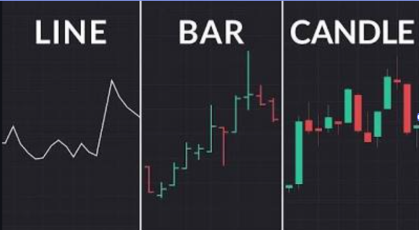
Traditional (Time-Based) Charts
Traditional charts create a new bar or candle after a specific period of time such as 1 minute, 1 hour, or 1 day.
These are the most commonly used charts in technical analysis.
Image: Line Chart vs Bar Chart vs Candlestick Chart Comparison
1. Line Chart
What Is a Line Chart?
A line chart is the simplest chart used in technical analysis.
It connects the closing price of a stock over time using a continuous line.
Advantages
✔ Very easy to understand
✔ Excellent for identifying long-term trends
✔ Removes short-term market noise
Limitations
✘ Does not show intraday price movement
✘ Does not display Open, High, and Low prices
Best Used For
• Long-term investing
• Market trend analysis
• Index analysis
A line chart is often the best starting point for beginners because it focuses entirely on the broader trend.
2. Bar Chart (OHLC Chart)
What Is a Bar Chart?
Bar charts provide more information than line charts.
Each bar displays:
• Open
• High
• Low
• Close
This is why bar charts are often called OHLC charts.
How to Read a Bar Chart
• Top of bar = Highest Price
• Bottom of bar = Lowest Price
• Left tick = Opening Price
• Right tick = Closing Price
Advantages
✔ Detailed price information
✔ Shows volatility clearly
✔ Popular among professional traders
Limitations
✘ More difficult to read than line charts
✘ Less visually intuitive than candlesticks
Best Used For
• Detailed price analysis
• Trend analysis
• Professional trading
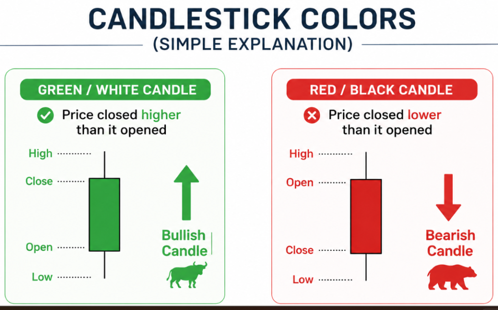
3. Candlestick Chart
What Is a Candlestick Chart?
The candlestick chart is the most widely used chart in modern technical analysis.
Developed by Japanese rice traders centuries ago, candlesticks provide a detailed visual representation of market sentiment and price behaviour.
In this lesson, you will learn how candlesticks reveal the ongoing battle between buyers and sellers. Rather than memorizing patterns, you will learn how to interpret market behaviour through candle structure, understand the psychology behind price movement, and identify important candlestick formations.
By the end of this lesson, you should be able to:
✔ Understand what a candlestick represents
✔ Interpret candle bodies and wicks
✔ Recognize buying and selling pressure
✔ Understand market conviction and indecision
✔ Identify major bullish and bearish candlestick patterns
✔ Understand the psychology behind candlestick formations
Introduction
Most beginners learn candlestick patterns by memorizing names such as Hammer, Doji, Shooting Star, or Engulfing Pattern.
While these names are useful, memorization alone rarely leads to a deeper understanding of technical analysis.
A candlestick is not simply a shape on a chart.
A candlestick is a visual record of market behaviour.
Every candle represents a battle between buyers and sellers during a specific period of time. It shows who controlled the market, who lost control, where demand emerged, where supply entered, and how traders reacted to changing prices.
Understanding this behaviour is far more important than memorizing pattern names.
Once traders learn how to interpret what a candle is communicating, technical analysis becomes significantly more logical and meaningful.
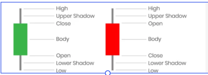
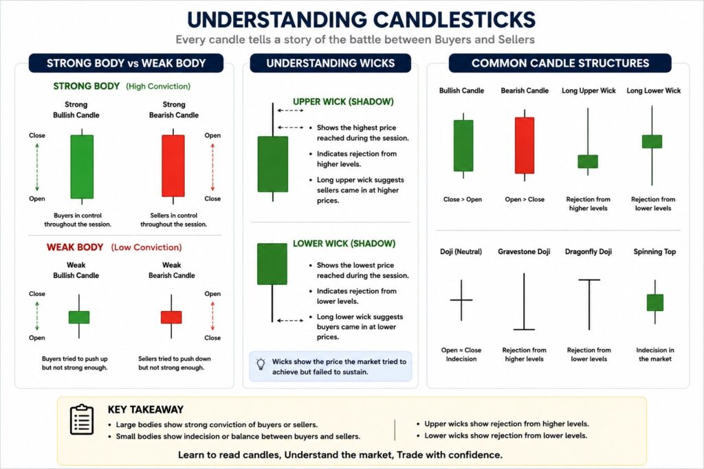
What Is a Candlestick?
A candlestick represents four important pieces of information during a specific time period:
Opening Price
Highest Price
Lowest Price
Closing Price
These four values create the shape of the candle.
A candlestick consists of:
Body
The body represents the difference between the opening and closing prices.
Upper Wick
The upper wick shows the highest price reached during the session.
Lower Wick
The lower wick shows the lowest price reached during the session.
Together, these components tell the story of how price moved throughout the trading period.
A Candlestick Is a Story
Imagine a stock opens at ₹100.
During the day, buyers become aggressive and push the price to ₹115.
Later, sellers step in and push the stock back to ₹108.
Before the market closes, buyers regain some control and the stock finishes at ₹112.
Now imagine compressing that entire battle into a single candle.
High ₹115 │ │ ┌───┐ │ │ └───┘ │ │ Low ₹100
Open ₹100 Close ₹112
Without reading a single news article, the candle instantly tells us:
Buyers were stronger than sellers.
Sellers resisted higher prices.
Buyers maintained control into the close.
Demand exceeded supply.
This is the real purpose of candlestick analysis.
Every candle is a summary of market behaviour.
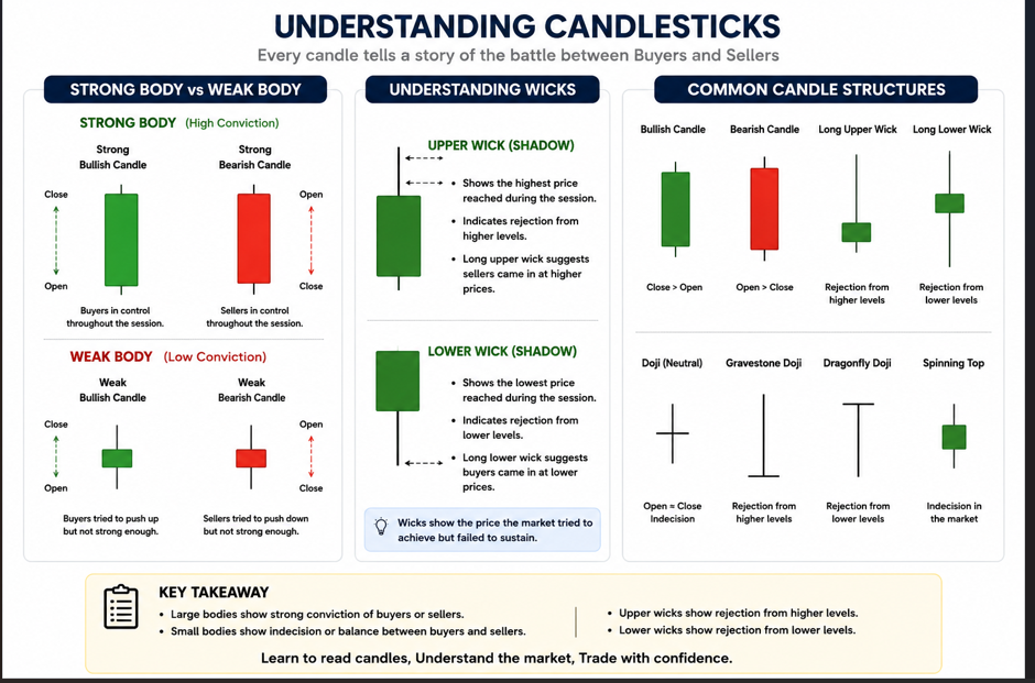
Understanding Market Behaviour Through Candle Structure
Before studying patterns, it is important to understand what different candle structures reveal about market psychology.
Large Candle Bodies
Large candle bodies often indicate conviction.
When a stock closes significantly above or below its opening price, it suggests that one side controlled most of the trading session.
A large bullish candle indicates strong buying pressure.
A large bearish candle indicates strong selling pressure.
Large bodies often appear during:
Strong trends
Earnings reactions
Breakouts
Major news events
The larger the body, the stronger the conviction behind the move.
Large Bullish and Bearish Candle Examples
Small Candle Bodies
Small candle bodies often indicate uncertainty.
Neither buyers nor sellers were able to establish clear control.
Small candles frequently appear during:
Consolidation phases
Market indecision
Before major news events
Near important turning points
The market is effectively waiting for additional information before committing to a direction.
Large Bullish Candle Large Bearish Candle
Strong Buying Pressure Strong Selling Pressure High Conviction High Conviction
Small Body Candle Examples
Long Upper Wicks
A long upper wick reveals rejection from higher prices.
Buyers initially pushed the stock higher.
However, sellers eventually gained control and forced the price lower before the close.
The longer the upper wick, the stronger the evidence that higher prices attracted selling pressure.
Market Message
“Buyers tried to move higher, but sellers fought back.”
Long Lower Wicks
A long lower wick reveals rejection from lower prices.
Sellers initially pushed the stock lower.
However, buyers absorbed the selling pressure and forced prices higher before the close.
The longer the lower wick, the stronger the evidence that buyers defended lower levels.
Market Message
“Sellers tried to move lower, but buyers fought back.”
Understanding Market Conviction
One of the most valuable skills in technical analysis is recognizing conviction.
Conviction refers to the confidence behind a move.
A stock that closes strongly near its highs often demonstrates bullish conviction.
A stock that closes strongly near its lows often demonstrates bearish conviction.
When conviction is strong, trends tend to continue.
When conviction weakens, reversals become more likely.
Candlesticks help traders identify these shifts long before many indicators react.
Understanding Market Indecision
Markets are not always confident.
Sometimes buyers and sellers are evenly matched.
During these periods, price may move significantly during the session but finish near where it started.
These situations create indecision candles.
Indecision often appears:
Before major breakouts
Before major reversals
During consolidation
Ahead of important events
Understanding indecision is just as important as identifying strong trends.
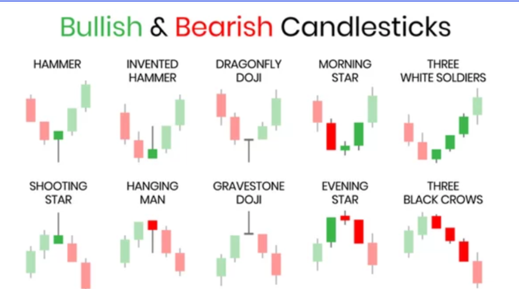
Bullish Reversal Patterns
Bullish reversal patterns suggest that selling pressure may be weakening and buyers may be regaining control.
Hammer
The Hammer is one of the most recognizable bullish reversal patterns.
Psychology
At first, sellers dominate and push prices sharply lower.
Later, buyers absorb the selling pressure and drive prices back toward the opening level.
The long lower wick represents failed selling pressure.
The small body near the top shows buyers regaining control.
Market Message
“Sellers attempted to continue the decline but failed.”
Inverted Hammer
The Inverted Hammer often appears after a decline.
Psychology
Buyers attempt to push prices higher.
Although sellers prevent a strong close, the candle reveals that buying interest is beginning to emerge.
Market Message
“Buyers are testing higher prices.”
Bullish Engulfing
A Bullish Engulfing pattern occurs when a large bullish candle completely engulfs the previous bearish candle.
Psychology
The previous session favored sellers.
The current session shows buyers overwhelming that selling pressure.
Control shifts rapidly from sellers to buyers.
Market Message
“Buyer strength has increased significantly.”
Morning Star
The Morning Star is a three-candle bullish reversal pattern.
Psychology
First candle: Strong selling pressure.
Second candle: Indecision and uncertainty.
Third candle: Strong buying pressure.
Together, these candles suggest that sellers are losing control and buyers are beginning to dominate.
Market Message
“A potential bullish reversal is developing.”
Morning Star Pattern
Bearish Reversal Patterns
Bearish reversal patterns suggest that buying pressure may be weakening and sellers may be regaining control.
Shooting Star
A Shooting Star forms after an advance.
Psychology
Buyers push prices sharply higher.
However, sellers eventually overwhelm buyers and force prices back down.
The long upper wick represents rejection from higher prices.
Market Message
“Buyers attempted to move higher but failed.”
Hanging Man
The Hanging Man appears after an uptrend.
Psychology
Sellers manage to push prices significantly lower during the session.
Although buyers recover some of the decline, the candle reveals increasing selling activity.
Market Message
“Selling pressure is beginning to emerge.”
Bearish Engulfing
A Bearish Engulfing pattern occurs when a large bearish candle completely engulfs the previous bullish candle.
Psychology
Buyers controlled the previous session.
The current session shows sellers overwhelming buyers.
Control shifts rapidly from buyers to sellers.
Market Message
“Selling pressure has increased significantly.”
Evening Star
The bearish counterpart of the Morning Star.
Psychology
First candle: Strong buying pressure.
Second candle: Indecision.
Third candle: Strong selling pressure.
The pattern suggests that bullish momentum is weakening.
Market Message
“A potential bearish reversal is developing.”
Indecision Patterns
Sometimes the market is not ready to choose a direction.
These situations often create indecision patterns.
Doji
A Doji forms when opening and closing prices are nearly identical.
Psychology
Neither buyers nor sellers gain meaningful control.
The market finishes the session in balance.
Market Message
“The market is undecided.”
Dragonfly Doji
Shows strong rejection of lower prices.
May indicate emerging buyer strength.
Gravestone Doji
Shows strong rejection of higher prices.
May indicate emerging seller strength.
Spinning Top
A spinning top contains a small body with relatively long wicks.
Psychology
Both buyers and sellers were active.
Neither side established dominance.
Market Message
“Market uncertainty remains high.”
Continuation Patterns
Not every pattern signals a reversal.
Some patterns indicate that the current trend is simply pausing before continuing.
Rising Three Methods
A strong bullish candle is followed by several smaller bearish candles.
These smaller candles remain within the range of the original bullish candle.
A final bullish candle then resumes the trend.
Psychology
Temporary profit-taking occurs.
Buyers remain in control.
Market Message
“The uptrend may continue.”
Falling Three Methods
The bearish equivalent of the Rising Three Methods.
Psychology
Temporary buying occurs within a larger downtrend.
Sellers remain dominant.
Market Message
“The downtrend may continue.”
Common Mistakes Traders Make
Memorizing Patterns Instead of Understanding Behaviour
Patterns are created by market psychology.
Understanding behaviour is more important than memorizing names.
Ignoring Volume
Volume often helps confirm the significance of a pattern.
Strong volume increases confidence.
Weak volume may reduce reliability.
Trading Every Pattern
No pattern guarantees success.
Technical analysis is based on probabilities, not certainty.
Ignoring Trend Direction
Patterns that align with the prevailing trend tend to be more reliable.
Ignoring Risk Management
Even the strongest candlestick setup can fail.
Proper risk management remains essential.
Key Takeaway
Candlestick analysis is not about memorizing shapes.
It is about understanding the behaviour of buyers and sellers.
Every candle represents a battle between demand and supply. Every wick reveals rejection. Every body reflects conviction. Every pattern represents a shift in market psychology.
Once traders learn to interpret the story behind the candle rather than simply recognizing the pattern, technical analysis becomes significantly more meaningful and effective.
In the next lesson, we will move beyond individual candles and explore Market Structure & Advanced Chart Patterns to understand how larger price formations develop over time.
In this lesson, you will learn how trends develop, how market structure reveals the balance between buyers and sellers, and how advanced chart patterns emerge from changes in demand and supply.
By the end of this lesson, you should be able to:
✔ Identify bullish, bearish, and sideways market structures
✔ Understand the psychology behind pattern formation
✔ Interpret chart patterns in the context of market structure
Introduction
In the previous lesson, we learned how individual candlesticks reveal the battle between buyers and sellers. A single candle can provide valuable information, but markets do not move based on one candle alone.
As prices move over days, weeks, and months, candles combine to create larger structures. These structures help traders understand whether buyers are gaining strength, sellers are taking control, or the market is simply consolidating before its next move.
This larger picture is known as Market Structure.
Many traders immediately jump to chart patterns without first understanding market structure. However, chart patterns are not random shapes. They are visual representations of how demand and supply interact over time.
Understanding market structure first makes chart patterns easier to interpret and significantly improves decision-making.
What Is Market Structure?
Market structure refers to the way price moves over time.
Every market creates a sequence of highs and lows.
By studying these highs and lows, traders can determine:
Trend direction
Trend strength
Potential reversals
Areas of demand
Areas of supply
Unlike indicators, which are derived from price, market structure focuses directly on price behaviour.
This makes it one of the most important foundations of technical analysis.
The Three Types of Market Structure
Every market operates within one of three broad structures:
Uptrend
Downtrend
Sideways Market
Understanding these structures helps traders identify who currently controls the market.
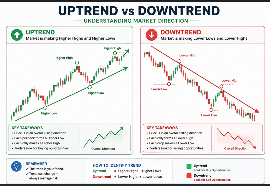
Uptrend Structure
An uptrend occurs when buyers consistently maintain control.
A healthy uptrend creates:
Higher Highs (HH)
Higher Lows (HL)
What Is a Higher High?
A Higher High occurs when price exceeds the previous swing high.
This suggests buyers are willing to pay increasingly higher prices.
What Is a Higher Low?
A Higher Low occurs when a pullback ends above the previous swing low.
This indicates buyers are stepping in sooner during corrections.
Together, Higher Highs and Higher Lows form the foundation of a bullish trend.
Example
₹100 → ₹120 → ₹110 → ₹140 → ₹125 → ₹160
Notice:
₹120 → ₹140 → ₹160 = Higher Highs
₹110 → ₹125 = Higher Lows
This indicates strong buyer control.
Downtrend Structure
A downtrend occurs when sellers dominate the market.
A healthy downtrend creates:
Lower Highs (LH)
Lower Lows (LL)
What Is a Lower High?
A Lower High occurs when a rally fails to exceed the previous high.
This indicates weakening buying pressure.
What Is a Lower Low?
A Lower Low occurs when price breaks below the previous low.
This indicates increasing seller control.
Example
₹300 → ₹250 → ₹280 → ₹220 → ₹260 → ₹180
Notice:
₹300 → ₹280 → ₹260 = Lower Highs
₹250 → ₹220 → ₹180 = Lower Lows
This indicates strong seller dominance.
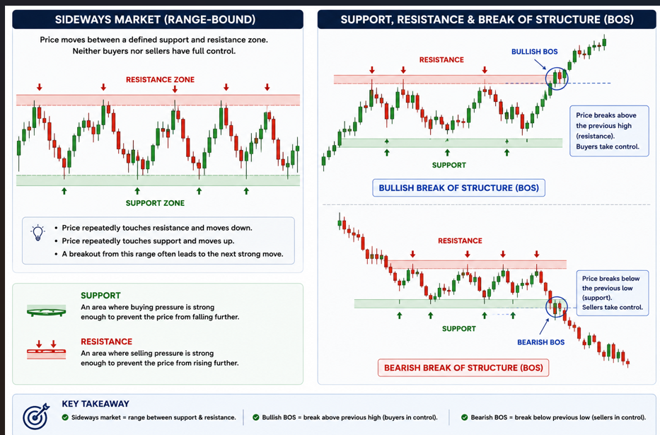
Sideways Market Structure
Not every market trends.
Sometimes buyers and sellers reach temporary equilibrium.
During these periods:
Support repeatedly holds
Resistance repeatedly holds
Price remains within a defined range
This is called a sideways market or consolidation phase.
Why Consolidation Matters
Many of the strongest trends begin after a period of consolidation.
During consolidation:
Buyers accumulate positions
Sellers distribute positions
Volatility contracts
Pressure gradually builds
Eventually one side gains control and a breakout occurs.
Why Market Structure Matters
Many traders rely heavily on indicators.
However, indicators are derived from price.
Market structure allows traders to understand price directly.
A trader who understands structure can often:
Spot trend changes earlier
Avoid false signals
Identify stronger setups
Improve risk management
Before most major trend reversals occur, market structure usually changes first.
Support and Resistance
Support and resistance are the building blocks of market structure.
These levels represent areas where demand or supply previously became significant.
Support
Support is an area where buying pressure becomes strong enough to prevent further declines.
When price repeatedly finds buyers near a certain level, that area becomes support.
Support is usually a zone rather than a precise price.
Example
If a stock repeatedly rebounds near ₹500, traders begin viewing ₹500 as a demand zone.
Resistance
Resistance is an area where selling pressure becomes strong enough to prevent further advances.
When sellers repeatedly emerge near a certain level, that area becomes resistance.
Example
If a stock repeatedly struggles near ₹1000, traders begin viewing ₹1000 as a supply zone.
Break of Structure (BOS)
One of the earliest signs of a changing trend is a Break of Structure.
A Break of Structure occurs when price violates the existing market structure.
Bullish Break of Structure
In a downtrend:
Lower High → Lower Low → Lower High
If price suddenly breaks above the previous Lower High, buyers may be regaining control.
Bearish Break of Structure
In an uptrend:
Higher High → Higher Low → Higher High
If price falls below the previous Higher Low, seller strength may be increasing.
A Break of Structure does not guarantee a reversal, but it often provides an early warning signal.
Why Chart Patterns Form
Many beginners treat chart patterns as prediction tools.
In reality, chart patterns form because buyers and sellers repeatedly behave in similar ways under similar conditions.
As demand and supply interact, recurring structures appear on charts.
These structures help traders identify:
Trend continuation
Trend exhaustion
Potential reversals
Market indecision
Understanding the psychology behind a pattern is more important than memorizing its shape.
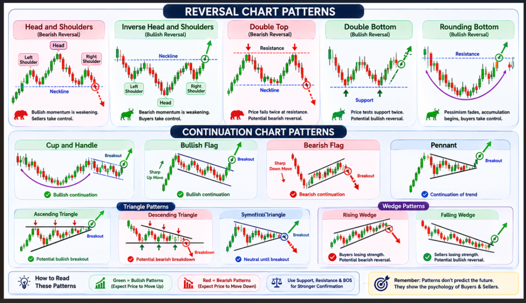
Reversal Chart Patterns
Reversal patterns suggest that an existing trend may be weakening and a new trend may be developing.
Head and Shoulders
The Head and Shoulders pattern is one of the most recognized bearish reversal patterns.
It consists of:
Left Shoulder
Head
Right Shoulder
Psychology
Buyers initially remain strong.
The Head creates a final push higher.
However, the Right Shoulder shows that buyers are losing momentum.
Eventually sellers gain control and the trend reverses.
Market Message
Bullish momentum is weakening.
Inverse Head and Shoulders
The bullish counterpart of the Head and Shoulders pattern.
Psychology
Sellers repeatedly attempt to push lower.
Each decline becomes weaker.
Buyers gradually regain control and eventually trigger a breakout.
Market Message
Bearish momentum is weakening.
Double Top
A Double Top forms when price reaches the same resistance area twice.
Psychology
The first rejection suggests supply.
The second rejection confirms that buyers are struggling to push higher.
Market Message
Potential bearish reversal.
Double Bottom
A Double Bottom forms when price tests the same support area twice.
Psychology
Sellers fail to create new lows.
Buyers begin absorbing supply.
Market Message
Potential bullish reversal.
Rounding Bottom
Unlike sharp reversals, a Rounding Bottom develops gradually.
Psychology
Pessimism slowly fades.
Selling pressure weakens.
Accumulation begins.
Buyers gradually gain control.
Market Message
Long-term trend transition.
Continuation Chart Patterns
Continuation patterns suggest that the dominant trend remains intact despite a temporary pause.
Cup and Handle
One of the most popular bullish continuation patterns.
Psychology
The market undergoes profit-taking and consolidation.
Buyers remain active throughout the correction.
The breakout often signals continuation of the trend.
Market Message
Bullish continuation.
Bullish Flag
A sharp upward move followed by a small downward-sloping consolidation.
Psychology
The market pauses temporarily while profits are booked.
Buyers eventually regain control.
Market Message
Trend continuation.
Bearish Flag
A sharp decline followed by a temporary upward retracement.
Psychology
Sellers pause briefly before continuing the decline.
Market Message
Bearish continuation.
Pennants
Pennants resemble small triangles that develop after strong directional moves.
Psychology
Demand and supply temporarily balance.
Eventually one side gains control and the previous trend resumes.
Market Message
Continuation of the previous trend.
Triangle Patterns
Triangles form when volatility gradually contracts.
As the range narrows, pressure builds.
The eventual breakout often produces a strong move.
Ascending Triangle
Features:
Flat resistance
Rising support
Psychology
Buyers become increasingly aggressive.
Each pullback becomes shallower.
Pressure builds beneath resistance.
Market Message
Potential bullish breakout.
Descending Triangle
Features:
Flat support
Falling resistance
Psychology
Sellers become increasingly aggressive.
Each rally becomes weaker.
Pressure builds above support.
Market Message
Potential bearish breakdown.
Symmetrical Triangle
Both support and resistance converge.
Psychology
Neither buyers nor sellers have control.
The eventual breakout determines direction.
Market Message
Neutral until breakout.
Wedge Patterns
Wedges often indicate weakening momentum.
Unlike triangles, wedges frequently signal trend exhaustion.
Rising Wedge
Price rises within narrowing boundaries.
Momentum gradually weakens.
Psychology
Buyers continue pushing higher but with decreasing strength.
Market Message
Potential bearish reversal.
Falling Wedge
Price declines within narrowing boundaries.
Selling pressure gradually weakens.
Psychology
Buyers begin absorbing supply.
The downtrend loses momentum.
Market Message
Potential bullish reversal.
Common Mistakes Traders Make
Memorizing Shapes Instead of Understanding Psychology
Patterns work because of demand and supply, not because of geometry.
Ignoring Market Structure
Always determine the trend before trading a pattern.
Ignoring Volume
Volume often confirms whether a breakout is genuine.
Trading Every Pattern
No pattern guarantees success.
Technical analysis is based on probabilities, not certainty.
Ignoring Risk Management
Even the strongest setup can fail.
Risk management remains essential.
Key Takeaway
Market structure forms the foundation of technical analysis.
Before studying indicators or advanced trading strategies, traders should understand how trends develop through Higher Highs, Higher Lows, Lower Highs, and Lower Lows.
Chart patterns are not random shapes. They are visual representations of demand, supply, and market psychology.
When traders learn to understand structure first and patterns second, charts become easier to interpret and technical analysis becomes more logical and effective.
In the next lesson, we will explore Volume Analysis, Accumulation, and Breakout Confirmation to understand why some breakouts succeed while others fail.
In this lesson, you will learn how volume helps traders evaluate the strength behind price movements and why volume is often considered one of the most important confirmation tools in technical analysis.
By the end of this lesson, you should be able to:
✔ Understand what volume represents
✔ Interpret price and volume together
✔ Identify accumulation and distribution
✔ Confirm breakouts using volume
✔ Recognize false breakouts
✔ Understand institutional participation
Introduction
Price tells us what happened.
Volume often tells us how important that move was.
Many traders focus entirely on price while ignoring volume. However, two stocks can display identical price movements while having completely different volume behaviour.
A breakout supported by strong volume is often more reliable than a breakout supported by weak volume.
Similarly, a decline accompanied by heavy volume may carry a different message than a decline occurring on light volume.
This is why volume remains one of the most important confirmation tools in technical analysis.
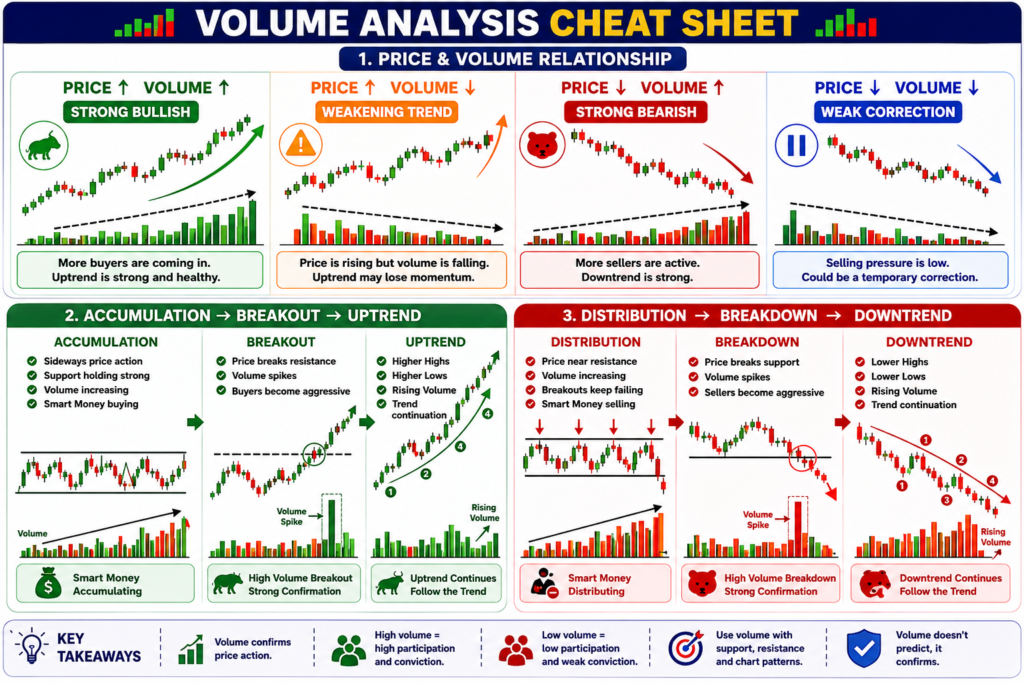
Volume Analysis Cheat Sheet
What Is Volume?
Volume represents the total number of shares traded during a specific period.
For example, if 10 lakh shares of a company are traded during a trading session, the daily volume equals 10 lakh shares.
Volume is usually displayed below the price chart and helps traders measure market participation.
Every transaction requires both a buyer and a seller.
The more participants involved in a move, the more meaningful that move often becomes.
Why Volume Matters
Price shows direction.
Volume shows participation.
Without volume, traders can see where price is moving but may struggle to understand how much conviction exists behind that move.
Volume helps answer important questions:
Are buyers becoming more aggressive?
Are sellers gaining control?
Are institutions participating?
Is a breakout likely to sustain?
Is the trend losing momentum?
Volume provides context that price alone cannot provide.
Understanding Price and Volume Together
Price and volume should always be analyzed together.
Neither should be viewed in isolation.
Rising Price with Rising Volume
This is generally considered healthy.
As prices rise, more participants become willing to buy.
Demand increases and the trend gains support.
Market Message
Strong buyer conviction.
Rising Price with Falling Volume
Prices continue rising, but participation gradually declines.
The trend may continue, but fewer participants are supporting it.
Market Message
Momentum may be weakening.
Falling Price with Rising Volume
Selling pressure increases as more participants exit positions.
The decline receives broad participation.
Market Message
Strong seller conviction.
Falling Price with Falling Volume
The stock declines, but selling urgency remains limited.
Participation decreases as price falls.
Market Message
Weak bearish momentum.
The move may simply represent a correction.
Understanding Accumulation
Accumulation occurs when large market participants gradually build positions.
Because institutions manage large amounts of capital, they rarely buy all their shares at once.
Instead, they often accumulate positions over time.
This process frequently occurs before major uptrends.
Common Characteristics
Stable price action
Strong support
Gradually increasing volume
Reduced downside momentum
Market Message
Demand is quietly increasing.
Potential bullish preparation phase.
Understanding Distribution
Distribution is the opposite of accumulation.
It occurs when large participants gradually reduce positions.
Distribution often develops near market tops.
Common Characteristics
Difficulty making new highs
Increased volume near resistance
Repeated failed breakouts
Rising volatility
Market Message
Supply is increasing.
Potential weakening of the trend.
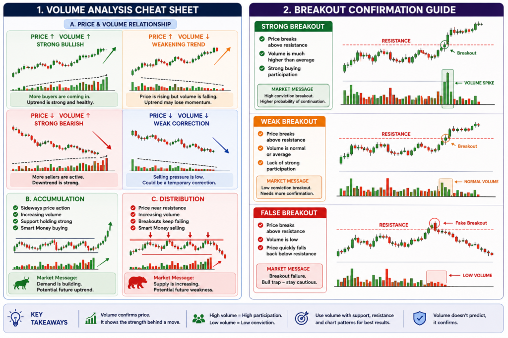
Volume and Breakout Confirmation
One of the most valuable uses of volume is breakout confirmation.
A breakout occurs when price moves beyond an important support or resistance level.
However, not every breakout succeeds.
Volume helps traders evaluate the quality of a breakout.
Strong Breakout
A strong breakout is usually accompanied by above-average volume.
Higher participation suggests stronger conviction behind the move.
Market Message
Higher probability of continuation.
Weak Breakout
A breakout that occurs on average or below-average volume deserves caution.
The move may lack broad market participation.
Market Message
Higher probability of failure.
False Breakout
A false breakout occurs when price briefly moves beyond support or resistance but quickly reverses.
These situations often trap traders who enter too early.
Common Causes
Low participation
Lack of institutional support
Short-term speculation
Profit-taking
Market Message
The breakout lacks conviction.
Institutional Participation
Large institutions often leave clues through volume.
Because institutions manage significant amounts of capital, their buying or selling activity can create unusual volume spikes.
Sudden increases in volume may indicate:
Institutional buying
Institutional selling
Earnings reactions
Major news events
Sector-wide interest
Volume often provides early evidence that larger participants are becoming active.
Volume During Consolidation
Consolidation periods can reveal important information.
A healthy consolidation often displays:
Stable price movement
Declining volume
Reduced volatility
This suggests the market is temporarily pausing rather than reversing.
Pressure gradually builds until one side eventually gains control.
Volume During Trend Reversals
Major reversals often occur alongside unusual volume activity.
Examples include:
Heavy volume after prolonged declines
Selling climaxes
Buying climaxes
Large volume spikes near important levels
These situations may signal changing market sentiment and deserve additional attention.
Common Mistakes Traders Make
Ignoring Volume Completely
Price alone rarely tells the full story.
Assuming Every Volume Spike Is Bullish
Volume can indicate either buying or selling.
Price action must always be considered.
Trading Every Breakout
Not every breakout succeeds.
Volume improves probability but does not guarantee success.
Ignoring Market Context
Volume should always be interpreted within the broader trend and market structure.
Key Takeaway
Price shows the result.
Volume shows participation.
While price tells us where a stock is moving, volume helps explain the strength behind that move.
Understanding accumulation, distribution, breakout confirmation, and institutional participation allows traders to evaluate the quality of price movements and avoid many common traps.
Volume becomes most powerful when combined with candlestick analysis, market structure, and chart patterns learned in previous lessons.
Lesson 5: Technical Indicators & Signal Confirmation
What You Will Learn
In this lesson, you will learn why technical indicators were created, what problems they help solve, and how traders use them to analyze trends, momentum, volatility, and market strength.
By the end of this lesson, you should be able to:
✔ Understand the purpose of technical indicators
✔ Know when to use MA and EMA
✔ Understand momentum through RSI
✔ Identify momentum shifts using MACD
✔ Analyze volatility using Bollinger Bands
✔ Measure trend strength using ADX
✔ Combine indicators with price action and volume
✔ Avoid common indicator mistakes
Introduction
In the previous lessons, we learned how to read charts, understand candlestick behaviour, identify market structure, recognize chart patterns, and use volume for confirmation.
At this stage, many beginners discover technical indicators and assume they can predict the future.
Unfortunately, that is not how indicators work.
Indicators do not predict future price movements.
They simply help traders understand what is already happening in the market.
Think of indicators as tools that simplify information.
Price remains the most important source of information.
Indicators exist to support price analysis, not replace it.
Before learning individual indicators, it is important to understand why they were created.
Even though the overall trend is upward, the daily fluctuations create noise.
Many traders become confused by these short-term movements.
Indicators help organize market information and answer specific questions.
Different indicators exist because traders want answers to different problems.
Question
Indicator
What is the trend?
Moving Average (MA), EMA
How strong is momentum?
RSI
Is momentum changing?
MACD
How volatile is the market?
Bollinger Bands
How strong is the trend?
ADX
Understanding the purpose of an indicator is more important than memorizing its settings.
Moving Averages (MA) – Finding the Trend
One of the biggest challenges in technical analysis is separating trend from noise.
Daily price movements often distract traders from the bigger picture.
Moving Averages were created to solve this problem.
A Moving Average smooths price fluctuations and helps reveal the underlying trend.
Instead of focusing on every candle, traders can focus on the broader direction.
Why Traders Use Moving Averages
Moving Averages help traders:
Identify trend direction
Filter market noise
Find dynamic support and resistance
Stay in trends longer
Reduce emotional decisions
Example
Suppose a stock moves from ₹100 to ₹180 over several months.
Along the way, it experiences numerous small corrections.
The chart may appear confusing.
A Moving Average helps reveal that the overall trend remains bullish despite temporary pullbacks.
Market Message
Moving Averages answer:
“Which direction is the market moving?”
Exponential Moving Average (EMA) – Why Was It Created?
While Moving Averages are useful, they have a limitation.
They react slowly.
Imagine a company announces exceptional earnings today.
The stock immediately jumps 10%.
A Simple Moving Average still gives equal importance to older prices from several weeks ago.
As a result, it reacts slowly.
The Exponential Moving Average was created to solve this problem.
EMA gives greater weight to recent prices.
This allows it to respond more quickly to changing market conditions.
Why Traders Use EMA
EMA helps traders:
React faster to new information
Identify short-term trend changes
Track active market movements
Generate earlier signals
SMA vs EMA
SMA
Smoother
Slower
Better for long-term trend analysis
EMA
Faster
More responsive
Preferred by active traders
Market Message
EMA answers:
“What is happening right now?”
while SMA answers:
“What is the broader trend?”
RSI – Measuring Momentum
Price and momentum are not always the same thing.
Imagine a runner sprinting.
The runner may still be moving forward, but the speed may be slowing.
Eventually the runner becomes exhausted.
Markets behave similarly.
RSI was created to measure momentum.
It helps traders understand the speed and strength behind a move.
Why Traders Use RSI
RSI helps traders identify:
Strong momentum
Weak momentum
Potential exhaustion
Overbought conditions
Oversold conditions
Example
Suppose a stock rises from ₹100 to ₹150.
RSI rises from 45 to 75.
This suggests buyers are highly aggressive.
Now imagine the stock rises further to ₹160, but RSI falls to 68.
Price is rising.
Momentum is weakening.
This creates an early warning signal.
Market Message
RSI answers:
“How strong is the move?”
not
“Will the stock rise tomorrow?”
MACD – Identifying Momentum Changes
RSI measures momentum.
MACD focuses on changes in momentum.
Think of driving a car.
Speed tells you how fast you are moving.
Acceleration tells you whether you are speeding up or slowing down.
MACD measures acceleration.
It helps traders identify when momentum begins changing.
Why Traders Use MACD
MACD helps traders identify:
Momentum shifts
Trend changes
Bullish momentum crossovers
Bearish momentum crossovers
Example
A stock may continue rising while momentum gradually weakens.
MACD often detects these shifts before they become obvious through price alone.
Market Message
MACD answers:
“Is momentum improving or deteriorating?”
Bollinger Bands – Understanding Volatility
Some stocks move calmly.
Others move violently.
Bollinger Bands were created to help traders visualize volatility.
Volatility refers to the degree of price fluctuation.
High volatility often indicates excitement or uncertainty.
Low volatility often indicates stability or consolidation.
Why Traders Use Bollinger Bands
Bollinger Bands help traders:
Measure volatility
Identify periods of expansion
Identify periods of contraction
Spot potential breakout conditions
Important Observation
When Bollinger Bands become very narrow, volatility contracts.
Large price movements often occur after these periods.
Market Message
Bollinger Bands answer:
“How much is the market moving?”
ADX – Measuring Trend Strength
Many traders confuse trend direction with trend strength.
A stock may be rising, but the trend could still be weak.
A stock may be falling, but the trend could be extremely strong.
ADX was created to solve this problem.
ADX measures the strength of a trend regardless of direction.
Why Traders Use ADX
ADX helps traders identify:
Strong trends
Weak trends
Sideways markets
Trending markets
Example
Two stocks may both be rising.
One stock rises steadily with strong participation.
The other rises inconsistently with frequent reversals.
ADX helps distinguish between these situations.
Market Message
ADX answers:
“How powerful is the trend?”
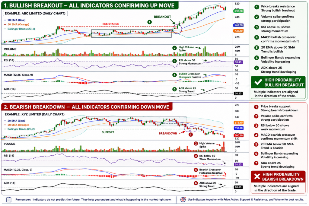
Educational Example: Multiple indicators are shown together to explain their purpose and interpretation. This is not a recommendation to use all indicators on a single chart.
Indicator Confluence
One of the biggest mistakes beginners make is relying on a single indicator.
Professional traders rarely make decisions based on one signal.
Instead, they look for confirmation from multiple sources.
Example:
Price breaks resistance
Volume increases
RSI rises above 50
MACD turns bullish
When multiple signals align, confidence improves.
This process is known as indicator confluence.
Indicators should support price action, not replace it.
Common Mistakes Traders Make
Ignoring Price Action
Indicators should support charts, not replace them.
Chasing Every Signal
Not every crossover or RSI reading creates a profitable opportunity.
Looking for Certainty
Indicators improve probabilities.
They do not guarantee outcomes.
Forgetting Market Structure
Indicators work best when combined with:
Price action
Volume
Support and resistance
Market structure
Key Takeaway
Technical indicators were created to solve specific problems.
Moving Averages help identify trends.
EMA helps traders react faster to changing conditions.
RSI measures momentum.
MACD identifies momentum shifts.
Bollinger Bands measure volatility.
ADX measures trend strength.
The most successful traders do not search for a perfect indicator.
Instead, they combine indicators with price action, volume analysis, and market structure to make more informed decisions.
Indicators do not predict the future.
They help traders better understand the present. The objective is to understand indicators, not to collect indicators.